What is a Lens MTF Chart
 |
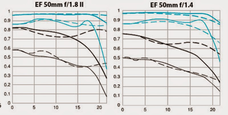
| lens mtf chart comparison of canon 50mm 1.8 and 1.4 lens. |
MTF is the abbreviation for Modulation Transfer Function which is a measurement of the optical performance of a lens. MTF charts will give you a better understanding of the optical quality of lenses, and can be useful references when researching, comparing and purchasing a lens.
MTF charts are the preferred tool for studying optical performance of lenses; as they use theoretical equations to plot a performance graph and don't rely on subjective opinion, subject matter, camera features, software or any other factors.
We all know that no lens is perfect; no matter how expensive they are, even the pricey lenses do not transmit 100% of the light that enters. What an MTF chart does is to plot the contrast and resolution of a lens from the center to its edges against a ‘perfect’ lens that would transmit 100% of the light that enters. The contrast of a lens is important as this works in correlation to lens resolution.
The y-axis (vertical axis) of a MTF chart plots the transmission of light through the lens with a maximum value of "1.0" which would indicate 100% transmittance of the light, although 100% transmittance of light is not possible because glass is not 100% transparent.
The x-axis (horizontal axis) shows the distance from the center of the image towards its edges. So, the "0" in the lower left corner represents the center of the lens and the numbers along the lower axis represent the distance out towards the edge of the lens in millimeters.
How to read a MTF chart
There are two groups of data plotted on an MTF chart: Sagittal and Meridional lines.
‘Sagittal lines’ (the solid lines) represent the contrast measurements of pairs of lines that run parallel to the central diagonal line that passes through the middle of the lens from the bottom left hand corner to the top right hand corner.
‘Meridional lines’ (the dotted lines; meaning relating to meridian) represent line pairs also positioned along an imaginary line from the center of a lens to the edge; these line pairs are perpendicular to the diagonal line.
In general, the higher and flatter the lines the better. Higher lines indicate better contrast (10 lines / mm) or resolution (30 lines /mm) while a flatter (left to right) line shows that the optical performance is close to the same at the edge of the image compared to the center.
Using a MTF chart to determine the bokeh effect of the lens
Another factor that can be read from the MTF graph is the 'bokeh' of the lens. Bokeh describes the quality of the out of focus areas in a picture. The bokeh effect varies between lenses and the effect is influenced both by the quality of the lens elements and the number of aperture blades in the lens design (more no of blades produce a better circle and therefore a better 'bokeh' effect).
In MTF charts; the closer the solid line and the dotted line are together, the softer the out of focus effect will be on a particular lens (meaning better bokeh).
Finding the Sweet Spot of a Lens using MTF Charts
When stopping down the lens from wide open apertures, the MTF of a lens typically increases for successively narrower apertures, then reaches a maximum for intermediate apertures, and finally declines again when we reach very narrow apertures.
The aperture corresponding to the maximum MTF is called ‘sweet spot’ of a lens, as images will generally have the best sharpness and contrasts at this settings.
Limitations of MTF Charts in Measuring Lens Performance
Even though MTF charts are useful for describing the quality of a lens, there are many limiting factors. An MTF chart says nothing about factors like Color-quality, chromatic aberrations, Image distortion, Vignette and Susceptibility to flare etc.
Also other factors like Focusing accuracy, camera shake, sensor dust, scratches, finger prints, moisture etc. present on the lens can have far more impact on image quality than small differences in MTF.
Also since MTF charts are not standardized; it can only be used to compare two similar lenses from the same manufacturer, same time difficult to compare across different manufacturers due to testing and display differences.
Putting all of this in simple terms
The left side of an MTF chart represents the center of the lens, as you move on to the right hand side it is the corner of the lens.
Invariably lenses are sharper in the middle and they get weaker as you get away from the center. Anything above 6 in the rating is considered good quality. Everything above 8 is considered of very good quality.
The dash lines and the different color lines represent different settings on the lens. It could be different focusing points, different apertures that are set, different types of contrast etc. Easiest method to remember is that; closer the lines are to the top of the chart the better the quality of the lens.
To select the better one from two lenses; you have to know how to interpret their MTF charts; only technically. How they fair in real life situations is going to be another. But this is one way to put a technical aspect on it.
NEXT: Image Stabilization / Vibration Reduction